Food Friend
Reimagining the Dining Experience for Users with Dietary Restrictions
Project Overview
About Food Friend
While there are many food-finding apps on the market, this app was intentionally designed to go beyond the standard offerings—particularly for individuals with dietary restrictions.
What sets it apart is its focus on personalized, inclusive dining options. Rather than just showing what’s available, the app tailors results to meet the unique needs of the user, creating a personalized and frictionless experience.
Team
Solo project under the mentorship of Angelo Presti
Tools Used
Miro, Excel, Figma, Adobe Suite
Duration
November 2023 - March 2024
Role
UX Design, UX Research, Branding, Product Design
The Design Brief
Problem
Many people with allergies or dietary restrictions face challenges in having safe and enjoyable dining experiences.
Project Goal
This project aims to redefine dining out by creating a product that allows people with dietary restrictions to have better control over finding accessible dining choices.
Solution
A mobile app that enables users to customize allergy profiles, find dining options, connect with others, and view detailed restaurant menus and reviews.
Research
Participant Recruitment: Focusing on Individuals with Dietary Restrictions
In-depth user interviews were conducted to identify key pain points experienced by individuals with dietary restrictions, including dietary preferences, allergies, and medical-related food limitations. Five participants with varying levels of restrictions were selected for comprehensive interviews. Insights were synthesized into four personas, two of which are highlighted here for their pivotal role in informing the design.
Key Insights
1
Dining out with dietary restrictions can be especially challenging in unfamiliar locations.
2
Dining out with dietary restrictions becomes increasingly stressful as group size and the diversity of needs increase.
3
Online restaurant information is only valuable when it directly addresses users' specific dietary needs.
Ideation
Solution Brainstorming for Key User Challenges
During the ideation phase, I explored a wide range of solutions, examining different approaches to address the problem statements and insights derived from user interviews. I developed "How Might We" (HMW) questions, focusing on key challenges such as: "How might we streamline the restaurant selection process for individuals with dietary restrictions?" and "How might we optimize the selection process for groups with intersecting dietary needs?"
Information Architecture
Defining and Distinguishing Core Functionalities Within the Platform
I conducted a competitive analysis of Google Maps, Yelp, and TripAdvisor to create user flows and sitemaps, organizing the app into four key categories: a search-focused home page, a saves page for bookmarked restaurants, a social page for user connections, and a profile page for editing diet preferences. This structure clarified the roles of search and community functionalities within the system.
User Flows
Defining Red Routes for Inclusive User Flow
User personas guided the identification of key red routes, informing a user flow that balanced the needs of both basic search functions and those engaging with the app’s social features.
Key
Onboarding User Flow
Restaurant Search and Save User Flow (The Essential Red Route)
Create and Interact with Groups Flow
Sketches
Refining User Flows as Ideas Solidified
The sketches helped refine my ideas into a structured user flow, leading to iterations in the social and save pages. Identifying redundancies in the community page flow and the saved page flow, I restructured components for better usability, ensuring the final design aligned with project goals and user needs.
Wireframes
Establishing Intricacies Within the User Flow
During the wireframing process, I developed more detailed pages and flows, further establishing the intricate details within user flows as the prototype took shape. While the final designs featured an even further iterated user flow, the wireframes established a clear structure, defining the app's functionality and serving as a crucial foundation for the final outcome.
Mood Board
Branding
Brand Development Centered on Core Functionality
In designing the branding and user interface, I prioritized functionality to enhance user experience. Given the app's multiple features, I aimed for a bold yet minimal design by developing high-fidelity screens with a monochrome primary color palette and subtle brand color accents. The essential imagery integral to the app's functionality already provided sufficient visual interest; adding more branding elements risked overwhelming the user.
Brand Name
The brand was designed to inspire excitement around food and dining. The name "Food Friend" was chosen to promote positive perceptions regarding dining out as research highlighted those with dietary restrictions often have a negative perception towards dining out.
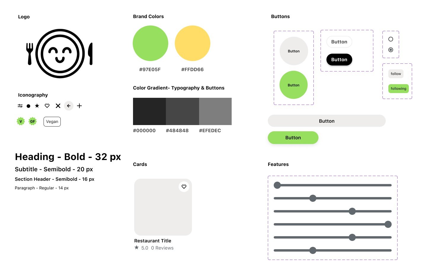
Logo
The logo, a smiling face on a plate, was intentionally chosen to evoke feelings of safety and positivity in users. The logo was concepted through sketches and finalized in Adobe Illustrator.
Brand Colors
The branding colors, green and yellow, were selected to represent happiness and safety, reinforcing the app's goal of offering a reassuring and enjoyable dining experience.
Style Guide
Protyping
Significant Updates to User Flow and Screens During Prototype Development
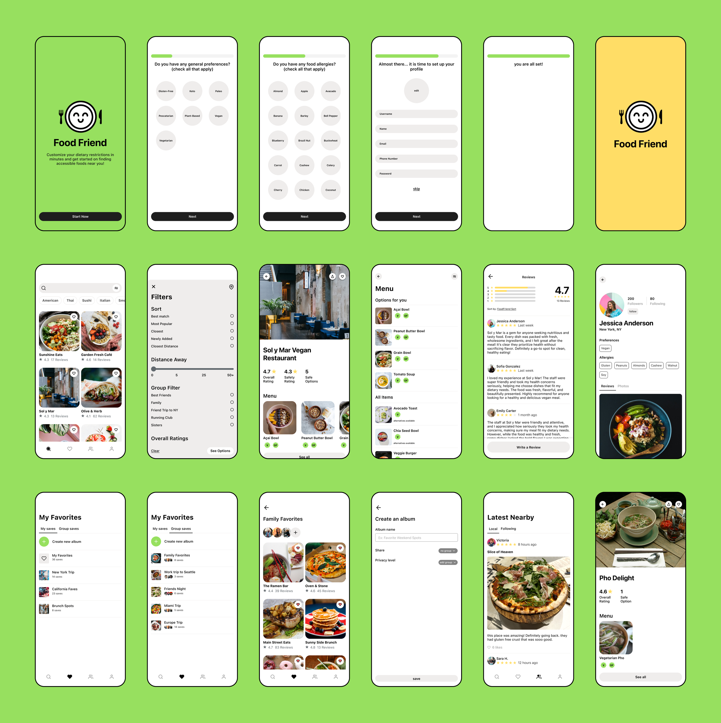
In this prototype, the red routes outlined in the sitemaps, sketches, and wireframes underwent significant evolution through iterative design. Key updates included streamlining the saves page by consolidating all saved components into one location and restructuring the community page to prioritize connections with users and reviews, simplifying access and enhancing overall usability. This project emphasized the importance of prioritizing key functionalities and refining concepts early in the process.
Testing
Interview Style
1:1 interviews conducted in-person and zoom.
Participants
Individuals with varying diets and age ranges were tested.
Insights
Certain CTA’s were not clear to users as they clicked on certain features expecting a response when there wasn’t one
Certain screens have inconsistencies in the UI as there were color differences.
The intention of the application was not clear from the onboarding process and users were slightly confused when onboarding
Opportunities
Create more consistency in the UI color
Use more concise wording in the onboarding screens as users set up their allergy profile
Present more information about “Food Friend“ during the onboarding process
Allow more CTA and responsive buttons on the restaurant page
Iterations
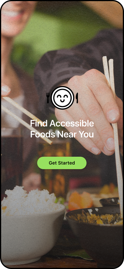
Iteration 1: Informative Onboarding With Improved Imagery and Precise Language
Following user testing, I revised the onboarding flow by incorporating informative screens to clarify the app's purpose. Initial feedback revealed that users were unaware of all features, leading to uncertainty during navigation. The updated screens employed clear language and visuals to better communicate the app's functionality and core features. In the second round of testing, users demonstrated a greater understanding of the app's purpose, resulting in more confident and directed navigation.
Before
After
Iteration 2: Clearer Wording and Visual Cues on Onboarding Screens
During the first round of testing, users experienced confusion during onboarding due to insufficient contextual information. To address this, clearer and more concise wording was added to the allergy profile setup, significantly enhancing user comprehension. The second testing round validated the effectiveness of these improvements.
Before
After
Key Features
1
Highly Customizable Search Functionality
User research revealed that finding accessible restaurants is especially challenging in unfamiliar areas and when dining with others. To address this, a collections feature was added, allowing users to plan in advance. This feature also enhances the app’s social aspect by enabling users to create collections together.
2
Dietary Profile When Looking at Reviews
User research revealed that online restaurant information is only helpful when it aligns with the user's specific dietary needs. To address this, the design includes visible allergy profiles for each reviewer, allowing users to easily find reviews from people with similar dietary restrictions.
3
Collections for Traveling and Groups
To ensure frictionless usability, I focused on simplifying the search experience. I made the search bar immediately accessible and used a white circle to highlight the filter button as a clear call to action.
Since users often search for specific cuisines, I introduced a sliding button carousel for cuisine options, separate from the filter section.
4
Local Reviews
User research showed that people with dietary restrictions highly value peer opinions. By incorporating a social feature, the app allows users to access real-time, local reviews and verify if reviewers share similar dietary needs.
Final Prototype
Ref lection
Key Reflection
Importance of Each Design Step: Through this project, I gained a deeper understanding of the design process and the significance of each step. Sketching and wireframing were crucial in shaping the app’s red routes and overall flow, ensuring the final screens delivered a cohesive user experience.
Value of Grid Systems: I also learned the value of design systems, particularly the importance of maintaining an 8-point grid. This grid became essential for both consistency and functionality as the design grew more complex. The more detailed and intricate the design became, the more critical it was to adhere to core design principles to ensure a seamless user experience.
Critical Reflection
User Research is Invaluable: This project reinforced the importance of understanding user needs. My background in psychology has fueled my passion for understanding people, and this project allowed me to cultivate that connection further. I’m deeply grateful to the participants who shared their insights during the interviews—their feedback was invaluable. By centering their needs throughout the design process, I was able to approach the project with intentional solutions that directly addressed real user challenges.
Prioritizing Critical Design is Key: This project taught me the importance of focusing and prioritizing ideas. Initially, I aimed to address all user needs and created ambitious concepts with complex red routes and numerous features. However, I soon realized the need to streamline and prioritize the most critical elements. In the end, I simplified the red routes in the final design. This experience reinforced that while design is always iterative, a key skill is knowing what to prioritize.


